The beauty of rapid e-learning authoring tools, such as Articulate Storyline2, is that you can turn good content into an interactive e-learning within minutes. Chock full of awesome built-in functions and features, Storyline2 makes it very quick to build different types of interactive content, quizzes and navigation. One advantage that the Articulate product provides is the Storyline2 Player.
Storyline2 Player
The Storyline2 Player is the interface the learner uses to navigate and interact with the course you design. Through the Storyline2 Player, learners can move around, progress, take a step backward, close the course, turn the volume up or down—and heaps of other things too.
Customise the player
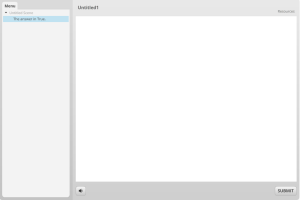
Every time you start a new Storyline project, your starting point looks like this:

That’s the default Storyline2 player. If you use Storyline2 regularly, you’ve probably looked upon its grey frames and rectangular whites many, many times.
Not that there’s anything wrong with that. But sometimes you’re going to want to be distinctive and stand-out. To do that, you might think you have to replace the default player with a fully customised navigation method. Nope, its way easier than that. You can simply give the built-in player a player-makeover.
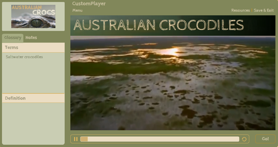
For my example here, I picked an Australian theme—crocodiles! Sure, you don’t need a theme, but in practice you’ll want to customise the Storyline2 Player to make it suit your learning content. This is just an example, so I’m arbitrarily saying that my content is about crocs.

I used one of Storyline2’s built-in colour themes called Median: its earthy, greeny colours match the subject matter pretty well. I used a video background on the first (and only) slide to add some context and chose a funky font called Cabin Sketch.
Then, I proceeded to customise all of the real player features my hypothetical course was using.
Customise the Invalid Answer pop-up: a video tutorial
This Invalid Answer pop-up appears when a learner tries to submit a question without choosing an answer. Even when the rest of the Player is cutomised, this is one component that many developers leave set to ‘as is’. In my example, the Invalid Answers pop-up has been customised to match the rest of the theme.
Rather than type all of that up here, I’ve made a video on how to customise that pesky notification window. Enjoy!
I’ve tweaked the basic slide into a quiz question so now you can see the customised Invalid Answers pop-up in action when you click GO!
Result
Click Play below to see the live demo.


Hack the example
As a double bonus, feel free to download the source file by clicking the button below:
Was there something more?
If you’d like to see some other examples of customised players, take a look at the entry for this week’s e-learning heroes challenge. The folks there have made some great customisations. Yeah, they know their stuff.
Did you find this useful? Leave a comment why don’t ya!


Love the customised Player Thank you for sharing 🙂
Thanks Grant!