The Challenge
Last week’s Dave Anderson’s e-learning challenge was to create a toggle effect. Once could use a button, a slider or any other creative way to achieve this.
The idea
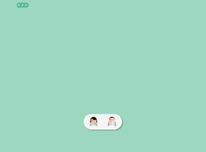
My first idea was to create a button where the user could choose an avatar to represent them for the rest of the course or game. Instantly I wanted to create a Star Wars toggle. But alas, it was extremely difficult to find any suitable Star Wars images for free. So, a bit disappointed, I settled for creating a simple choose-your-gender toggle button. I had a quick look at Pintrest, and really liked this one posted on Dribbble:
The Design
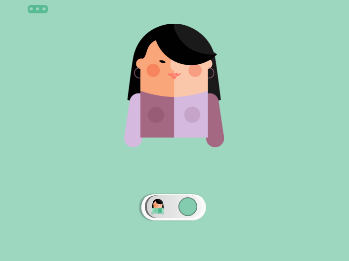
I used the same green colour for the background as my inspiration button, and created a somewhat similar effect on my button, all in Storyline so it’s not perfect, but good enough, I think. I used some different icons I found in my library and re-coloured them to suit.
I created two versions: one where you click the button and it instantly changes to the other option by way of a state change. The second where you click the button and it moves smoothly to the other side by way of a motion path. Thanks to Kevin Thorn for sharing his work and to Jeff Kortenbosch for motivating me to try out both methods through his blog post on the subject. I also added a small button that when clicked displays a dot-point explanation of each method.
The Magical Moment
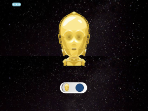
I had not finished this yet, and I was feeling slightly underwhelmed with my toggle, when, through sheer serendipity, two days ago someone shared a link on Twitter: FREE STAR WARS AVATARS! With renewed enthusiasm I set to work and finished the choose-gender toggle and added a Star Wars toggle, so there are 3 examples in total. For the Star Wars button I decided to use the motion paths method.
The Outcome

You know what to do! Click on the button below to see how it works:


Be First to Comment