Clipart is so 80’s, am I right, people?
Sure it is. There’s no point trying to deny it.
Any 80’s kid with even the slightest interest in computers tried to make use of cheesy Clipart at every opportunity. Illustrations jazz any subject up, right? That’s why images of ice creams and vintage cars were crammed—no matter how inappropriately—in the headers and margins of school papers about the circulatory system, Pythagoras’ theorem and modern democracy.

But hey, I’ve always had a fondness for it. (Clipart, that is. Not my 6th grade academic achievements. Although some of them were pretty awesome…)
The New Clipart
Here’s something you might not know: These days, many Clipart are vector images.
With vector-based Clipart, you can ungroup the elements and modify them to suit your needs. As vectors, you can even perform HTML5 animations and transitions, if that’s your thing.
So, Clipart has become quite a bit more versatile. Certainly, you can do more with it now than you used to, when you were wanting to to symbolise an unholy union so you jammed pink wedding cake into the margins of your essay about Arthur Miller’s The Crucible.

Clipart Vs Graphic Design
This is not to say that Clipart rivals customised graphics. It doesn’t and it won’t. Professional illustration and design is almost always worth the investment… if the budget exists.
But, if you’ve got a zero-dollar graphics budget and an inventive developer, Clipart can come in very handy.
A Sentimental Favourite: Style 1268
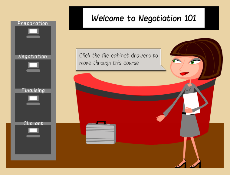
A personal favourite: Microsoft Clipart Collection’s Style 1268. It has about a hundred images, all free for Microsoft Office account-holders. Each image in the set is comprised of different objects that you can grab and tailor to your needs. It includes a number of different characters too, so you can efficiently and effectively populate scenarios and enhance your courses.
Clipart elearning Example
Below is an example of a quick challenge created with zero-budget for graphics. Created using the lovely Style 1268, this was put together quickly for an elearning heroes challenge. I only include it here as an example of when Clipart can be used effectively to meet a target (a bit like that time the cartoon scissors perfectly illustrated the point you were making in your Powerpoint presentation about cutting costs in the office).
Besides, retro-GUI is so hot right now.

Am I right, people? Click Play below to check it out.


Be First to Comment