This week, Dave challenges us to find creative ways to combine text and images.
Most of the work I do is pretty corporate-y, so with challenges and demos, I like to cut loose and find topics that are completely different to my normal everyday work.
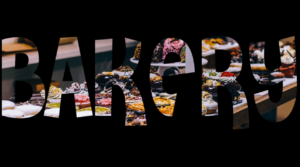
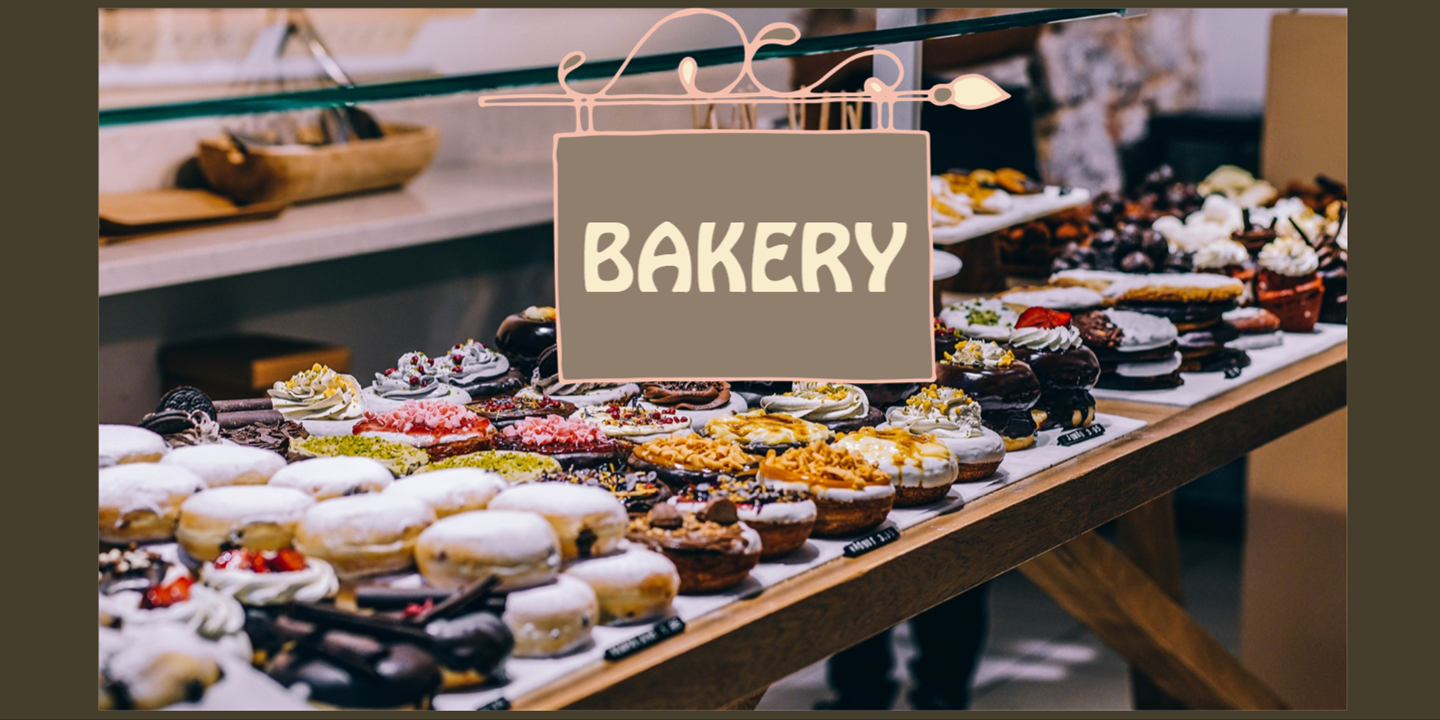
For this challenge, I created two demos. The first is a selection of title slides for a bakery. It uses the same image, but a few different text treatments over the image.

Click the PLAY button to take a look:

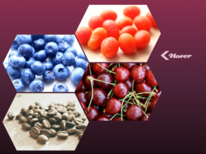
The second one is less polished—and a bit random. There are two title slides with different heading styles and one last screen with an interesting honeycomb photo collage.

See for yourself:

Hope these give you some ideas to create your own creative text and image combinations!

Be First to Comment