In this week’s e-learning heroes challenge, brave e-learning developers all over the world must battle it out to… naw, just kidding. This week we go mobile!
Our challenge is to design a navigation menu to use on a mobile phone or tablet. Now, I’ll be the first to admit that completing your e-learning on a mobile phone, maybe on the way to work… not great. The screen is small, it’s uncomfortable and most e-learning courses are not design for that kind of (lack of) space. That said, e-learning can be design for mobile, if, well, it’s designed for mobile. So I decided to give this a crack.
I was inspired by a post someone shared on Twitter a while ago from Behance, showing 25+ animated tab bar designs.
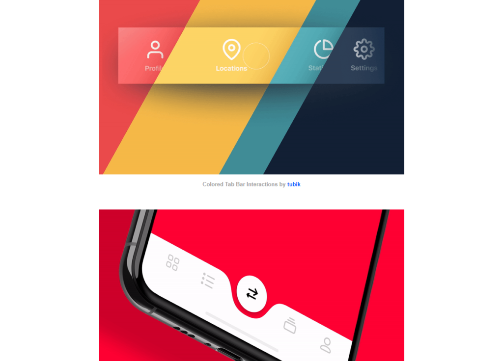
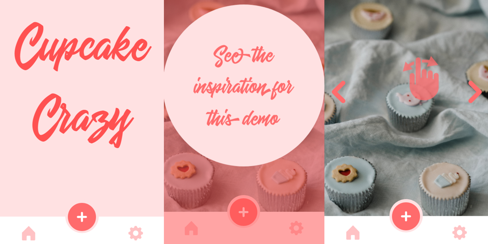
I singled out a few designs that I thought I could possibly replicate in some way in Storyline, and set to work on one of them. The original design was a lovely pale pink. And, I don’t know about you, but to me pale pink is cupcakes!
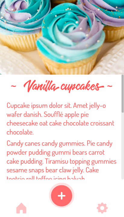
I gathered some related media and created an animated menu that vaguely resembles my chosen design, from Oleg Frolov. Hats off Oleg, and thank you for the inspiration!
If you’d like to have a look, here it is!
Here’s a video tutorial I created to show how to achieve this animated menu effect, enjoy!
Be First to Comment