The post UI Button kits appeared first on Veronica B.
]]>
I love creating simple graphics in PowerPoint. And, I love quirky-looking buttons and shapes. So one of my favourite tools in PowerPoint is ‘edit points’. Insert a rectangle or circle, edit points, tweak the points a little bit, and you have a quirky shape.
Needless to say quirky shapes don’t often impress the corporates, so any chance I get to use them I do.
Here I am sharing a button and shape set for e-learning created in PowerPoint. There are 3 sets, each with a different colour theme and font theme.
Feel free to download the file below. Modify and use as much as you like, enjoy!
Note: Font themes use system fonts, some Google fonts and an additional font:

The post UI Button kits appeared first on Veronica B.
]]>The post Gamify with badges and awards appeared first on Veronica B.
]]>Now, anyone who knows me knows that I take great pride in finding and fixing typos and spelling mistakes and grammatical errors, and pointing out the fact that I have done so. Naturally, now that I have said this, someone will find an error in this post… the irony.
Anyway, I decided to create an interaction where the learner races against the clock to find all the errors across three extracts from famous graduation speeches.

Try it for yourself! You’ll have 20 seconds to click on all the errors you find. When you find one, the correction—in red pen—will pop up.
If you get all errors within the time limit, you’ll earn a badge; if you don’t, you won’t, but you’ll be given another chance.

Give it a try by clicking PLAY below!

Wanna look inside? Feel free to download the source file (Storyline 360).
Fonts used:
- Courier New
- Journal
- Zilla Slab
And, please share!
The post Gamify with badges and awards appeared first on Veronica B.
]]>The post Leadership Template appeared first on Veronica B.
]]>E-learning Heroes Challenge 230 was all about putting together a template for leadership-style courses. For this challenge, I adapted a template I’d made quite a while a go.

I gave it a fresh coat of paint (a.k.a new theme colours) and changed the images to be more… leadery.
This template contains 42 unique slides, including some standard slides (e.g. introduction, learning objectives, summary), static layouts, interactive slides and assessment.

Check out the live demo by clicking PLAY below.
If you’d like to use this template, go right ahead—you can download it below
Enjoy!
The post Leadership Template appeared first on Veronica B.
]]>The post Interactive Video appeared first on Veronica B.
]]>So I set off to work. First, I thought about what topic I could make a quiz around. A few ideas I tossed around were weather and exercise… I settled on yoga poses and took advantage of the videos available to Articulate 360 subscribers in the Content Library.

I chose a simple white and purple colour scheme and a nice script font: Bender TF. I also took advantage of the icons available through the Content Library—who knew there were so many yoga icons?!
Edit: I received some great feedback from Jonathan Hill, a challenges super hero, regarding the font being a bit hard to read under the pressure of the timer, so I changed the options and instructions to a more legible Clayton font.
Test it out! Are you a Yoga Master, or a Yoga Newbie? Click PLAY below to find out.
And, if you’re interested, you can download the Storyline 360 file below:
The post Interactive Video appeared first on Veronica B.
]]>The post Medical Theme Template appeared first on Veronica B.
]]>The latest E-learning Heroes challenge called for sharing a starter template, this time for the healthcare industry. I quickly went through what I already had, and re-posted what I like to call a template with a ‘mild medical theme’ applied to it. You can see that one here.

Now, we all like to be creative and design unique looks and experiences, and that’s great. But sometimes (often times) we are restricted by time and budget. Templates are great when you really just have to get on with the job of producing a course…. quickly. While I really enjoy the creative process, from time to time I have to rely on a ready-made template. The thing is, you can still expand and modify any template you get your hands on. But at least the job of putting together a nice look and feel and several useful layouts has been done and you have a good base from which to elaborate.
New medical template
For this challenge, though, I wanted to add a bit more to it, so I went back to a module I developed last year for a health organisation. It was about empowerment, but in a healthcare context. I couldn’t share that one, so I re-did the look and feel and reduced it down to 10 common and re-usable layouts.

Live demo
You can take a look at the template by clicking below:
Freebie
If you like the template, you can grab the Storyline 360 file by clicking the image just below:

Enjoy!
The post Medical Theme Template appeared first on Veronica B.
]]>The post Custom Drop-down Menu in Storyline 360 appeared first on Veronica B.
]]>E-learning Heroes Challenge 164 is about using drop-down menus for navigation in e-learning. Storyline 360 does not have a built-in drop-down function, but we can easily create a custom drop-down menu.
Design
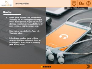
I created a short piece recently as a presentation to win a contract. We won the contract (yay) so I decided to re-purpose the demo as a template to share. Lucky for me, the demo includes a drop-down menu. I replaced most content with dummy content and changed the colour scheme to an orange-grey.
Menu
The drop-down menu I created is quite simple: Click the menu button and the menu rolls down using a wipe animation. Click the menu button again and it rolls right back up. There is a bit of complexity though—I added custom current and completed states to the four topics, so learners know where they are as well as what they’ve completed. A few variables make the menu work dynamically.
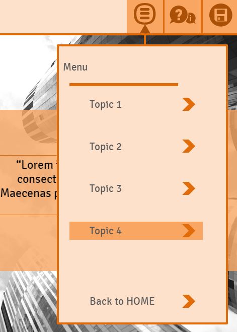
Go on, take a look, click Play.
Wipe down, wipe up
Here’s a quick video tutorial on how I achieved the reasonably smooth wipe down, wipe up effect. It’s also on the Help button.
Freebie
If you’d like to nab this template, click the download button below. And as always, let me know what you think in the comments below.

The post Custom Drop-down Menu in Storyline 360 appeared first on Veronica B.
]]>The post Accordion Interaction appeared first on Veronica B.
]]>Accordion interactions are pretty simple, but great for when you have a lot of related information and you want to keep it all on the same slide.
I chose a muted colour scheme and used some simple stock images to give an idea of how it could work.
There are two versions in the one project: a vertical accordion and a horizontal accordion (click NEXT to see it).

Vertical accordion 
Horizontal accordion
Check it out below:
If you’d like to use this interaction in your project, you can download it below:
Enjoy!
The post Accordion Interaction appeared first on Veronica B.
]]>The post Good ol’ desktop interaction (with freebie!) appeared first on Veronica B.
]]>I know that the web has gone flat, and I’m OK with that. And, at least for me, flat graphics are easier to design. That said, I still really like a bit of realism once in a while. I recently posted a couple of skeuomorphic demos, with free downloads. Today though, I went back to Dave Anderson’s e-learning challenge #5: Desktop Office Templates.
Check out the demo
As it so happens, my idea for a medically-inspired desktop theme was not received with the enthusiasm I had hoped, so I re-vamped it. Click Play below to see the live version, and I’ll share the download with you at the end of the post.
Assets
Many of the images came from Pixabay. I say this a lot, but Pixabay is a great site for images, both photographs, illustrations and even vectors. They are free even for commercial use, so make sure to buy them a cup of coffee every now and then.
The manila folder comes from ELH community free download. I wish I could credit it here, but it was so long ago I cannot remember who posted, my apologies.
The post it notes, tabs, papers and folder I created in PowerPoint. I’m happy to share those below too.

Adapt
This template contains 6 layouts. Naturally, you can extend it, change the colours, fonts (I used Century Gothic), position of objects, and anything else. If you do use it, send me a screenshot, I’d love to have a look.

Any questions or comments, leave them below and I’ll be sure to get back to you. If you’d like to download the Storyline source file, click below. Ditto for the PowerPoint graphics, plus a few bonus (random) graphics.
The post Good ol’ desktop interaction (with freebie!) appeared first on Veronica B.
]]>The post Blurred images in e-learning appeared first on Veronica B.
]]>I remember the not-so-good-‘ol days pre-digital cameras when you had to aim really carefully and make sure no one was moving to get a good photograph without any blur. Those days are well and truly over, with happy snaps being taken 24/7, left, right and centre. Blurred pic? No worries, there’s a thousand more where that came from!
In fact, now we use software to blur images on purpose! My 80s self would think the world has gone mad!
How to use blurred images in e-learning
This brings me to the point of this post. In e-learning, we often use background images to provide context or realism but, also often, we put other images and text on top. This can end up looking very busy and difficult for our learner to know where to focus their attention. Enter blurred images. By blurring the image in the background, you can provide that context while making sure that the important stuff stands out.
Blurred background demo
Here is a quick example I created for this week’s e-learning heroes challenge: using blurred backgrounds in e-learning. This demo shows a before and after the blur, as well as an alternative option that produces a similar result.
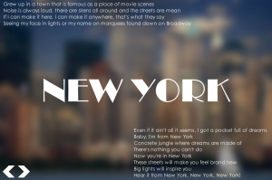
Interactive demo
I decided to expand this a bit more as I really like the look of the blurred city image. I chose six other beautiful city images and set to work.
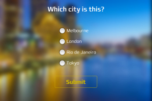
In this interactive demo, the learner’s job is to identify the city from its blurry image. If they can’t, the image becomes a bit less blurry to help them out. Once identified correctly—or not—the unblurred image reveals itself in all its glory.
Give it a try by clicking Play below. Can you get the job?
Bonus download
If you’re keen to look under the hood, you can download the source file below. All the images are from Pixabay.
How would you use this effect in e-learning? Let me know in the comments below.
The post Blurred images in e-learning appeared first on Veronica B.
]]>The post Wipe and survive the zombie apocalypse appeared first on Veronica B.
]]>Scratch and win
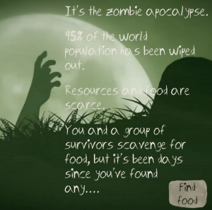
This week’s challenge is to create a scratch off effect, like what you would do with a coin if you buy a scratch and win card. This effect can be applied to other actions, such as erasing and wiping. I put my thinking cap on and suddenly remembered my long forgotten zombie challenge. You know how in zombie fiction—as opposed to real life zombies—often there are zombies trapped in cars? I had the idea to re-vamp my old challenge (which was a branching scenario) and create one where the learner has to wipe the windscreens of several cars to try to find food.
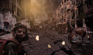
Wipe and survive the zombie apocalypse
While my interaction is very quick to get through, it took a while to create all the custom images and different screens for those who want to play again. There are quite a few variables too. The Articulate community members shared a number of ways in which to create the scratch off effect, or in this case, the wipe off effect, and I’ll do the same here. Watch this quick video tutorial if you’d like to learn how.
Want to see the live demo? Well why didn’t you say so? Click Play below, but beware, brains might get eaten!
Bonus download!
If you’d like to take a closer look at how this was built, look under the hood by clicking the download button.
As always, have your say in the comments below.
The post Wipe and survive the zombie apocalypse appeared first on Veronica B.
]]>