The post Who remembers the View-Master? appeared first on Veronica B.
]]>I love the theme for the second challenge of 2022: cut out and masking effects with animation! PowerPoint is so great for masking; add a pinch of Storyline animation and layers and you have magic!
Today, I have 70s magic. We just got back from a short holiday with the fam, so I created a photo gallery from the holiday in a view-master, but mine is called the Vacay-master.

Take a look by clicking PLAY below, enjoy!

The post Who remembers the View-Master? appeared first on Veronica B.
]]>The post 2021 Pantone Colour of the Year appeared first on Veronica B.
]]>We made it, and to kick things off, I made a little something for the last challenge of 2020: 2021 Pantone Colour of the Year… or colourS I should say as this year we see a grey (Ultimate Grey) and a yellow (Illuminating) make the cut.

I have been feeling a bit uninspired lately, but really wanted to participate in this challenge, and I LOVE a nice yellow + grey combo… I was watching my son play the Aliens vs. Predator steam game and I thought the menu screen looked really cool, and eerily grey and yellow.
So, I decided to pay homage to that video game’s menu screen and create a simple menu screen that uses the two colours in question.
What do you think? Click Play to check it out.
The post 2021 Pantone Colour of the Year appeared first on Veronica B.
]]>The post Static to interactive appeared first on Veronica B.
]]>Storyline has a great feature—convert to freeform—which allows you convert a static slide into any one of 6 types of interactive slide, including drag and drop and others. The challenge for heroes this week is to create 6 interactive versions of the same static slide.

Now, I must confess—I cheated. I actually created a static slide from scratch, and then made 6 interactive slides from that starting point.
Interactive Poirot
I decided on a topic I absolutely love: Hercule Poirot! I am a big fan of Agatha Christie, and more recently we’ve been watching the TV series: Agatha Christie’s Poirot.

In this demo, you’ll learn about the four main characters in the show—but only for 3 seconds. Then, there’ll be 6 different questions about them.
Here it is!
The post Static to interactive appeared first on Veronica B.
]]>The post Game: Play movie quotes! appeared first on Veronica B.
]]>In this simple game, you’ll be shown 10 famous movie quotes. Your job is to type in the quote, if you know it or as best as you know it. Then, you get to check the correct quote.

I went for a retro-y sort of vibe and used (possibly way too many) gradients, which I am really loving at the moment.
I’ve created interactions like this for clients before. They are a great way to get learners to think and reflect… yes, it’s true that someone can just type in gibberish—there’s no way to know what they type—but for the majority who is in there trying to learn, this breaks up the multiple choice question cycle and gets their brains thinking a bit differently.
You think you know your movie quotes? Play the game to find out!
The post Game: Play movie quotes! appeared first on Veronica B.
]]>The post Summary slide with animated video appeared first on Veronica B.
]]>Things to include could be PDF documents, external links, attachments, and more.
I’ve started playing around with animated video using Vyond, so I decided that for this project I’d create a simple and short animated video including a few summary points from the ‘course’ and some external links.

In Vyond, I chose the Common Craft style and selected a few basic props and shapes to create the video. I then put it all together in Storyline 360, of course, including a bit of tango music!
This will take you about 20 seconds to check out, click PLAY below!
The post Summary slide with animated video appeared first on Veronica B.
]]>The post Animated button effects in Storyline appeared first on Veronica B.
]]>A few years back, I started something for a similar challenge 89. But alas, I didn’t finish it and it sat in my folder with the sad PENDING label attached to it… until this week!
This demo shows 3 slides:
- The first is a button style I saw ages ago on a website that was encouraging me to click YES.
- The second is a button style I created for a client long ago; I have always loved this button because it is colourful and happy.
- The third is a set of 12 buttons, which I was inspired to create after seeing some of the awesome entries by my fellow elearning heroes.

Below you can check out the live demo, and below that feel free to download the Storyline source file.

The post Animated button effects in Storyline appeared first on Veronica B.
]]>The post The ADDIE framework appeared first on Veronica B.
]]>It’s traditionally known as a ‘waterfall’ model in the sense that once the water falls, you can’t get it back. So, once a stage in ADDIE is complete, no changes are possible once you move on to the next stage. This sounds quite restricted, so as ADDIE evolved over time more flexible versions have been adopted by designers, and some have since moved on to more agile or iterative processes.

That said, it’s great to be familiar with different frameworks and models, and while I don’t explicitly or strictly follow the ADDIE model in my work, there are many, many aspects of it that naturally occur.
This week’s e-learning heroes challenge is about ADDIE! It asked us to design an interaction to help course designers learn a bit more about ADDIE.

I chose to create a simple click-reveal interaction showing the basics of each step. For graphics, I downloaded some free images from Undraw.co and for content I used some text from this great article by Eoghan Quigley.
Take a look!
The post The ADDIE framework appeared first on Veronica B.
]]>The post Labelled graphic interaction appeared first on Veronica B.
]]>This week has been really great; apart from normal dev work I’ve also been training a group of designers on the ins and outs of Storyline.
In doing so, I was demonstrating how to create a hotspot question, and my Windows Explorer opened to my folder for this week’s challenge: Interactive graphics!
It was only slightly embarrassing, as my topic for this challenge is… meat! So, I went ahead and created a hotspot question with… the sections of a pig… oh well.

Anyway, I decided to create a meat shop scene with an initial labelled graphic where the learner can select between beef, pork or chicken.
Then, each of those opens up a new screen with a graphic of each of those animals, covered in tiny, little Storyline makers, with love heart icons!
Check it out below, it’s finished off with some weekend market sounds… come get your meat!
The post Labelled graphic interaction appeared first on Veronica B.
]]>The post Mobile-inspired appeared first on Veronica B.
]]>Our challenge is to design a navigation menu to use on a mobile phone or tablet. Now, I’ll be the first to admit that completing your e-learning on a mobile phone, maybe on the way to work… not great. The screen is small, it’s uncomfortable and most e-learning courses are not design for that kind of (lack of) space. That said, e-learning can be design for mobile, if, well, it’s designed for mobile. So I decided to give this a crack.
I was inspired by a post someone shared on Twitter a while ago from Behance, showing 25+ animated tab bar designs.
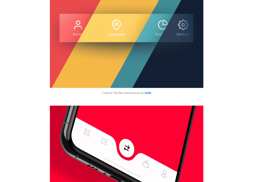
I singled out a few designs that I thought I could possibly replicate in some way in Storyline, and set to work on one of them. The original design was a lovely pale pink. And, I don’t know about you, but to me pale pink is cupcakes!
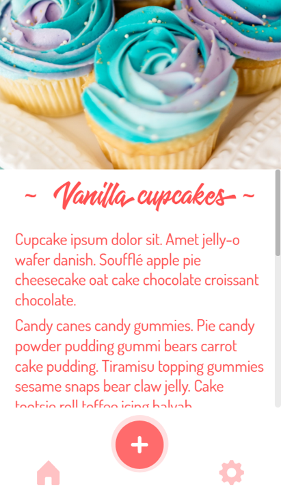
I gathered some related media and created an animated menu that vaguely resembles my chosen design, from Oleg Frolov. Hats off Oleg, and thank you for the inspiration!
If you’d like to have a look, here it is!
Here’s a video tutorial I created to show how to achieve this animated menu effect, enjoy!
The post Mobile-inspired appeared first on Veronica B.
]]>The post Custom results – Kondo-style! appeared first on Veronica B.
]]>You may have seen many e-learning courses where, after completing the assessment, learners are presented with… this:

I wanted to do something that was playful but also quite minimalistic in look and feel, and somehow I thought of the Marie Kondo method of tidying. Now, I know people had been raving about it and how it’s changed their lives… and then they’d look at me and say ‘ah, you don’t need it’… I am a very tidy person and the opposite of a hoarder…
Nonetheless, I chose a Marie Kondo-inspired quiz. I designed a completely white player and background, selected a subtle, sans-serif, light font (Dubai Light) and found a vector image of a desk and office items, which I customised to be mostly greys with just one accent colour, a darkish orange.

The results slide is where it all happens. When you get to it after 4 gruelling questions, it will:
- tell you how well you know the Kondo method, and
- predict what your desk and office space looks like, based on your responses.
Wanna see? Get your headphones, cutesy music will guide you through…
Video tutorial
Want to see how it’s done? Here’s a fresh video tutorial, enjoy!
Freebie download
Feel free to download the source file below.
The post Custom results – Kondo-style! appeared first on Veronica B.
]]>